
As tablets continue to blur the line between mobile devices and desktop computing, the choice between landscape vs portrait orientation has become increasingly important for both users and designers. Tablets offer the flexibility to rotate the screen and adapt the image orientation based on activity, context, or content type. But which orientation is more effective—and in what situations?
This article explores how screen orientation affects the user experience (UX), productivity, media consumption, and digital design on tablets. With a focus on vertical format vs horizontal format, we’ll break down the pros and cons of each layout and offer insights on when to use portrait mode or landscape mode.
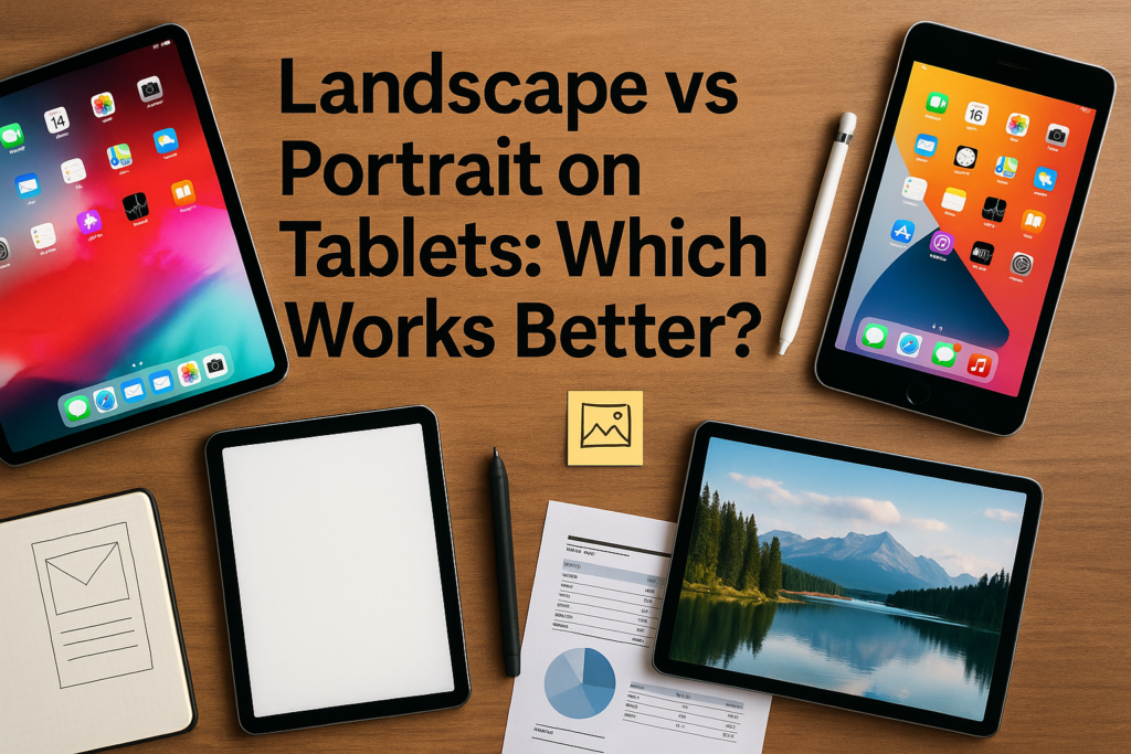
The Importance of Orientation on Tablets
Unlike smartphones, which are primarily used in portrait orientation, or laptops, which are fixed in landscape, tablets are versatile. Users can rotate them easily to switch between portrait and landscape views, offering flexibility in how they interact with apps, media, and content.
This fluidity means that design orientation needs to be responsive, ensuring a seamless experience regardless of how the device is held. It also makes it crucial for content creators, UI/UX designers, and developers to understand how orientation impacts layout grid, visual hierarchy, and design flow.
Understanding the Two Modes
What Is Portrait Mode?
Portrait mode is the vertical format of the screen—taller than it is wide. This orientation mimics a sheet of paper or a smartphone held upright.
Use cases:
- Reading articles or eBooks
- Social media scrolling
- Writing or editing documents
- Taking vertical photography
- Using portrait apps with stacked navigation
Portrait mode aligns with natural thumb zones and ergonomic use, especially for users holding a tablet in one hand. It also better supports portrait layout design patterns used in publishing and poster orientation.
What Is Landscape Mode?
Landscape mode is the horizontal format—wider than tall. It’s the default for widescreen content and mirrors laptop and desktop environments.
Use cases:
- Watching videos or attending video calls
- Gaming and immersive media
- Using two apps side by side (split screen)
- Browsing image galleries or using landscape photography apps
- Filling out wide tables or spreadsheets
This mode takes advantage of aspect ratio design commonly found in digital media formats, such as 16:9 video or horizontal navigation menus.
For a broader understanding of design implications, see:
👉 Landscape vs Portrait in Graphic Design
Landscape vs Portrait: Usability on Tablets
Productivity and Work Tasks
Tablets are often used as productivity tools, especially with accessories like styluses and keyboards. In productivity apps (Microsoft Word, Excel, Google Docs), landscape orientation typically performs better.
- It offers a wider page orientation for editing complex documents.
- Split screen mode is more practical.
- Interfaces like toolbars and tabs align naturally in landscape.
However, portrait mode is better for focused, single-app workflows such as:
- Reading and annotating PDFs
- Writing documents
- Taking notes vertically
Learn how orientation affects editing in productivity tools:
👉 Landscape vs Portrait: Layout Tips for Landscape Contractors
Media and Content Consumption
When it comes to videos, landscape orientation is king. Tablets in landscape mode fully utilize the screen for 16:9 video content, offering a cinematic experience. That said, portrait mode dominates in short-form video platforms like TikTok or Instagram Reels.
Photo viewing also depends on photo layout. Portraits, headshots, and vertical art look better in portrait, while group shots and scenic vistas suit landscape.
For media creators, designing for both is essential. Smart composition techniques ensure visual integrity when rotating between orientations.
Explore orientation in artistic contexts:
👉 Landscape vs Portrait in Art: Key Differences
Design Considerations for Responsive Orientation
Layout and Grid Structure
In portrait layout, content is stacked top-to-bottom, often in a single column. This structure is ideal for reading-based apps and news platforms.
In landscape layout, a multi-column structure allows for:
- Side-by-side comparisons
- Enhanced visual hierarchy
- Horizontal sliders and carousels
Designers must ensure adaptive layouts that automatically adjust padding, margins, and image sizes during orientation changes. Fluid UI/UX design ensures consistency and usability.
For example, a banner design that works in portrait might look awkward in landscape unless the layout grid adapts dynamically.
Font and Button Scaling
Tablet screens range from 7 to 13 inches, and orientation affects how much content is visible without zooming or scrolling. In portrait, font sizes should be legible without overwhelming vertical space. In landscape, designers may need to adjust line length and spacing to avoid awkward text wrapping or horizontal scrolling.
Touch zones should also adapt—thumb-friendly zones in portrait shift toward side access points in landscape, especially on larger tablets.
Orientation and Input Method
The way users interact with tablets also changes with orientation. In portrait mode, users tend to tap with thumbs or index fingers while holding the device vertically. In landscape mode, especially with a keyboard attached, the tablet mimics a laptop—making it ideal for typing and using trackpads or mice.
Stylus users also benefit from different modes depending on task:
- Vertical mode for sketching detailed portraits or note-taking.
- Horizontal mode for drawing landscapes or designing large scenes.
Accessibility and User Behavior
Accessibility is often overlooked but is critical in orientation design. Larger font settings or custom scaling must be preserved across orientations. Similarly, orientation locking (preventing screen rotation) is often enabled by users with motor or visual impairments.
Analyzing user behavior helps refine UI strategies:
- Are users engaging more in one orientation?
- Do they switch to landscape for video or multi-tasking?
- Is there orientation drop-off during app use?
Data-informed design flow ensures the experience is optimized for real-world usage.
For UX-specific orientation effects, see:
👉 Landscape vs Portrait UI: How Screen Orientation Affects UX
Print vs Digital: Tablet Usage in Hybrid Workflows
Tablets bridge the gap between print vs digital. Apps like Adobe Acrobat, GoodNotes, and Microsoft OneNote are used to review, sign, and annotate printable documents. Ensuring that digital content respects paper orientation (portrait for forms, landscape for presentations) improves usability.
Users often read portrait print documents on tablets but flip to landscape print for spreadsheets or slide decks. Designers must maintain formatting across both views.
To explore this further in a printing context, read:
👉 Landscape vs Portrait: Which Is The Best for Printing?
Conclusion
So, which orientation works better on tablets—landscape or portrait? The answer is: it depends on the use case.
- Portrait orientation is ideal for reading, writing, browsing, and personal consumption.
- Landscape orientation excels in productivity, media playback, and multi-tasking.
The best user experience comes from responsive design that accommodates both orientations. Creators, developers, and users should think beyond defaults and optimize their tablet use based on context.
Whether you’re designing an app, reading a PDF, watching a video, or editing a spreadsheet, understanding landscape vs portrait ensures you get the most out of every pixel.