
In the world of professional landscaping, presentation can be just as critical as the design itself. Whether you’re showcasing a garden plan, architectural layout, or landscape proposal, how you frame your visuals has a lasting impact on your client’s perception. This is where the choice between landscape vs portrait layout becomes essential—not just in printed documents, but across screens, tablets, and interactive platforms.
This guide explores how orientation choices can enhance client presentations, improve clarity, and support better decision-making in landscape design architecture. You’ll learn when to use each layout, how they affect eye-tracking and visual storytelling, and how to adapt your approach for both digital and physical presentations.
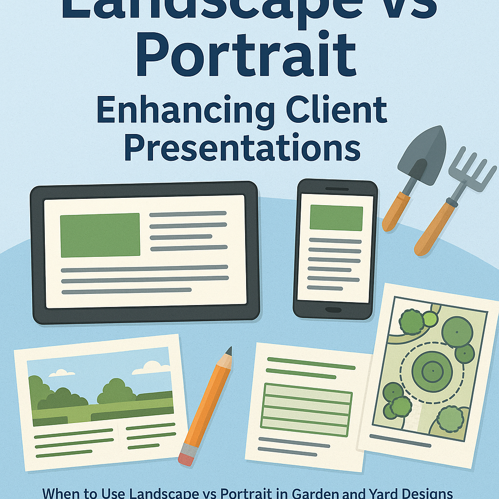
Understanding Landscape vs Portrait Orientation
What Is Landscape Orientation?
- A horizontal layout—wider than it is tall.
- Often used for site plans, drawing guides, or expansive overviews.
- Mimics human vision’s natural range and is ideal for digital and screen-based presentation formats.
What Is Portrait Orientation?
- A vertical layout—taller than it is wide.
- Common for printed handouts, vertical garden concepts, or close-up drawings.
- Focuses attention on single features, vertical elevations, and structured flow.
The orientation you choose affects not just aesthetics, but how well clients can interpret and engage with your designs.
Why Orientation Matters in Client Presentations
Eye-Tracking and User Focus
Clients process visual information differently depending on the layout:
- Landscape formats support a Z-pattern eye movement, ideal for design walkthroughs and spatial layouts.
- Portrait formats guide the viewer top-to-bottom, enhancing comprehension for vertical features or hierarchical data.
When creating a landscape drawing guide or plan review, using the appropriate orientation enhances retention and encourages client interaction.
Using Landscape Orientation to Your Advantage
Best for Site Overviews and Flow Representation
Landscape format excels at displaying:
- Full yard layouts, with zones clearly segmented
- Flow of space—paths, lawn areas, seating, and water features
- Design architecture with broad, interconnected elements
In screen-based presentations, horizontal drawing gives clients a sense of immersion, showing how each component connects across the property.
Ideal for Digital Presentations
Whether using PowerPoint, PDFs, or tablets:
- Landscape screens align with client expectations
- Enables side-by-side comparisons of before-and-after views
- Offers room for text, annotations, and icons without crowding
For tablet usability insights, see Landscape vs Portrait on Tablets: Which Works Better?
Leveraging Portrait Orientation in Specific Scenarios
Emphasizing Detail or Vertical Features
Portrait orientation is best when your design involves:
- Vertical drawing—like showcasing a wall garden, tall hedge, or sculpture
- Zoomed-in renderings of a single garden section
- Step-by-step planting instructions or design process documentation
Portrait layouts help control focus. They’re particularly useful for clients with limited design literacy who benefit from visual exercises presented in an intuitive flow.
Optimizing Print Presentation
Printed materials such as:
- Garden care guides
- Planting schedules
- Design inspiration portfolios
…are easier to manage and more familiar when presented vertically. For a real-world example, check out: When to Use Landscape vs Portrait in Garden and Yard Designs
Best Practices for Presentation Orientation
1. Match Orientation to Your Client’s Viewing Medium
- Use landscape if you’re screen-sharing, using a projector, or emailing a presentation.
- Use portrait if providing a printed packet or walk-through booklet.
2. Keep Paper Orientation Consistent in Documents
Switching between orientations mid-document can confuse clients. Instead:
- Separate portrait and landscape views into different sections
- Use clear composition techniques to guide attention regardless of layout
3. Use Orientation to Support Storytelling
Create a narrative flow:
- Start with a landscape overview to set context
- Dive into portrait detail views for emphasis
- End with a mixed-format summary slide or page showing integration
Want to align layout decisions with user behavior? Read Landscape vs Portrait UI: How Screen Orientation Affects UX
Visual Storytelling with Mixed Layouts
Combining both orientations can bring your presentation to life:
- Use landscape slides to showcase full project scope and flow
- Insert portrait-style visuals for storytelling moments—client testimonials, vertical structures, or feature highlights
This layered approach also accommodates varied client preferences—some want to “see it all,” while others prefer to zoom in on specifics.
Orientation in Design Architecture Presentations
For those working in landscape design architecture, orientation also determines how technical aspects are presented:
- Landscape drawings: essential for blueprints and elevation plans
- Portrait documentation: ideal for form-based communication, permits, and schedules
Both orientations play a role in professional workflows, and your client-facing materials should reflect this fluency.
Real-World Use Case: Residential Garden Redesign
A landscape contractor redesigns a suburban garden with:
- A new walkway
- Raised beds and vertical planters
- Pergola installation
Presentation Strategy:
- Start with a landscape layout of the site plan
- Add a portrait rendering of the vertical planter and trellis wall
- Close with before-and-after visuals in landscape format
This multi-orientation structure allows clients to appreciate both macro and micro aspects of the design.
Conclusion: Orientation Shapes Understanding
The battle of landscape vs portrait isn’t about which is better—it’s about choosing the one that helps your clients understand your vision. The right orientation increases trust, reduces confusion, and positions you as a thoughtful, detail-oriented professional.
- Use landscape for big-picture planning and screen-based delivery
- Use portrait for focused storytelling and printed materials
- Mix them purposefully for the best client experience
Explore More on Orientation Strategy
- When to Use Landscape vs Portrait in Garden and Yard Designs
- Landscape vs Portrait UI: How Screen Orientation Affects UX
- Landscape vs Portrait on Tablets: Which Works Better?
Would you like a visual header image created for this article to summarize the orientation tips?