
In the world of landscape architecture, your portfolio is your voice, brand, and visual resume. Whether printed or digital, how you structure your portfolio influences how your work is perceived. One of the most impactful yet often underestimated design choices is orientation landscape vs portrait. This decision directly affects layout logic, viewer flow, image presentation, and how clearly your design ideas come across.
Choosing the right orientation for your portfolio is not simply an aesthetic choice. It is a strategic move that aligns your work with client expectations, project scope, and storytelling intent.
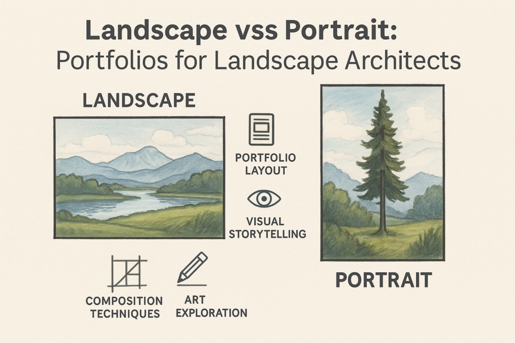
Orientation and Portfolio Narrative
Landscape orientation mimics how we naturally see the world, making it ideal for showcasing site layouts, panoramic views, and spatial sequences. Portrait orientation, being vertical, narrows the viewer’s attention and allows for more focused storytelling, which is ideal for highlighting specific features, elevations, or individual details.
In a portfolio context:
- Landscape format is best for showcasing master plans, full-spread images, and side-by-side comparisons
- Portrait format is suited to displaying vertical compositions, section drawings, or tiered content layouts
Each orientation offers a different rhythm and focus. The best portfolios often use one as the dominant structure while incorporating elements of the other when strategically appropriate.
Composition Techniques for Portfolio Layout
Effective portfolio layout uses core composition techniques that align with the orientation.
In landscape portfolios:
- Use the rule of thirds horizontally to balance drawings and photos
- Design spreads that allow for breathing room between sections
- Sequence content from left to right to support eye-tracking patterns
In portrait portfolios:
- Stack images and content blocks vertically for scrolling or paging
- Use central alignment for full-page detail renderings
- Create a narrative flow that guides the viewer downward from concept to execution
These layout techniques help elevate the visual experience and reinforce your design sensibility.
Visual Storytelling Through Orientation
Every landscape architect’s portfolio tells a story—from conceptual thinking to site execution. Orientation helps frame that story.
A landscape orientation supports broader storytelling, ideal for:
- Demonstrating large site plans
- Comparing design options across a spread
- Presenting multi-phase projects in one cohesive view
Portrait orientation supports deeper storytelling, ideal for:
- Taking the viewer through step-by-step details
- Presenting plant palettes and material studies
- Zooming in on vertical components like retaining walls or seating areas
Refer to Landscape vs Portrait: Showcasing Landscape Work to explore how orientation decisions influence viewer perception in real-world examples.
Drawing Orientation and Paper Size
For printed portfolios, paper orientation and size work hand in hand. A3 or tabloid size in landscape orientation offers spacious layouts perfect for horizontal site plans and large images. A4 or letter-sized portrait orientation makes handling easier, especially for submissions, interviews, and print-on-demand books.
Use landscape paper for:
- Fold-out drawings
- Site progression diagrams
- Sequential visual storytelling
Use portrait paper for:
- Compact presentations
- Page-by-page vertical visual exercises
- Focused concepts and section studies
This applies especially when submitting to design schools or competitions where format guidelines may favor one orientation over the other.
Orientation and Eye-Tracking Behavior
Understanding how people view your portfolio helps you guide their experience. In landscape orientation, eye-tracking follows a natural Z-pattern, perfect for pairing images with descriptions and side-by-side comparisons. In portrait orientation, top-to-bottom scanning supports hierarchy and helps structure linear presentations.
In interviews or public presentations, the way pages are flipped also matters:
- Landscape pages allow for smooth horizontal reading
- Portrait pages align better with digital PDF scrolling and tablet browsing
This ergonomic awareness strengthens viewer engagement, as explored further in Landscape vs Portrait: Enhancing Landscape Design Workshops.
Mixed-Orientation Strategies
Some landscape architects choose to create hybrid portfolios, combining both formats for dramatic effect. This approach requires careful balance but can enhance storytelling.
Use mixed-orientation strategies to:
- Isolate important features using portrait pullouts in a landscape book
- Feature a vertical element (like a tower or staircase) with a portrait insert
- Contrast phases of a project using alternating spreads
This technique, when used thoughtfully, showcases your versatility and control over visual composition.
Orientation in Digital Portfolios
Digital portfolios give you more flexibility in orientation. Landscape formats work well in web galleries, fullscreen slideshows, and video portfolios. Portrait formats are great for mobile viewing, LinkedIn previews, and vertical content platforms.
If designing a digital PDF portfolio:
- Landscape works well on laptops, tablets, and desktop monitors
- Portrait is ideal for scrolling interfaces, e-books, and PDF submissions
Also consider that online competition submissions may prefer specific formats. Always read the fine print and tailor your orientation accordingly.
Practical Visual Exercises
To decide what works best, conduct these visual exercises:
- Layout 5 sample projects in both orientations
- Ask peers or mentors which format feels clearer, more professional, and immersive
- Print small mockups and review them side by side
These exercises help you develop your own intuitive approach to orientation and refine your visual communication style.
Conclusion: Let Orientation Elevate Your Portfolio
Choosing landscape vs portrait orientation in a portfolio is more than a design decision—it’s a storytelling tool. It shapes how your ideas unfold, how your visuals breathe, and how your work is remembered.
Whether you’re designing for clients, firms, or academic review, intentional use of orientation can showcase your strengths with clarity and precision. Let format support your story, and use orientation not just as a frame—but as a feature.
Explore more, visit:
Landscape vs Portrait: Design Thinking for Landscapers