
In today’s digital-first world, how a user interacts with a screen defines their experience. Whether browsing a landscape contractor’s website, using a landscape design app, or viewing architectural portfolios, one critical design decision plays a massive role in usability and perception: screen orientation. The debate between landscape vs portrait layouts in UI (User Interface) design directly affects readability, comfort, and interaction especially in fields like landscape design architecture, visual planning, and mobile UX.
This guide explores how orientation influences user experience (UX), when to use each format, and what landscape professionals and digital designers need to know to optimize their visuals and interfaces.
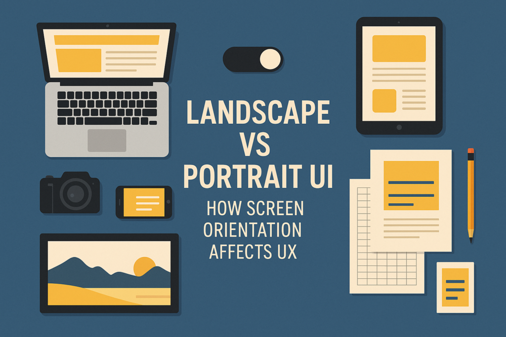
What Is Screen Orientation in UI Design?
Landscape Orientation
Landscape mode refers to a horizontal layout, where the screen is wider than it is tall. It’s common for desktop monitors, televisions, tablets, and widescreen laptops. Landscape is naturally aligned with the way humans see—horizontally—and supports multi-panel layouts, split views, and panoramic content.
Portrait Orientation
Portrait mode is a vertical layout, taller than it is wide. It dominates smartphone use, social media feeds, reading apps, and vertical storytelling platforms like TikTok or Instagram Reels. Portrait UI is designed for linear interaction, single-column content, and thumb-scrolling.
Understanding the difference between these orientations is crucial when designing for modern digital platforms. For foundational differences beyond screens, visit Landscape vs Portrait in Art: Key Differences
Why Orientation Matters in UX
Eye-Tracking and Layout Efficiency
Humans process visual content differently based on screen format. Research shows:
- Landscape layouts allow for natural eye-tracking in a Z-pattern, especially on desktop or widescreen devices. This enhances readability for detailed visuals such as a landscape drawing guide or design software interface.
- Portrait layouts encourage a vertical scan—top-to-bottom flow—which fits modern mobile habits like scrolling and swiping.
For landscape contractors presenting proposals, the chosen orientation can determine whether a client absorbs key project information or skips over it.
Landscape vs Portrait in Different UX Contexts
Desktop UX and Landscape Format
Most desktop applications and web interfaces are optimized for landscape orientation because:
- More horizontal drawing space allows multitasking and side-by-side comparisons.
- Visual-heavy industries like landscape design benefit from expansive layouts to show full project scopes.
- Landscape supports wider menus, interactive dashboards, and panoramic imagery.
This is especially beneficial when showcasing landscape design architecture, where layouts need to reveal spatial depth, multiple design layers, or a property’s footprint.
Mobile UX and Portrait Format
Mobile UI relies heavily on portrait layouts due to screen constraints and one-hand usability. Advantages include:
- Ergonomic design aligned with thumb movement and single-column reading.
- Clear visual storytelling as users scroll through content, one frame at a time.
- Better suited for displaying images, videos, and tools in stacked sections.
Apps that include art exploration, visual exercises, or even vertical drawing tutorials are often more intuitive when designed vertically.
Best Use Cases for Each Orientation
Use Landscape When:
- Designing an app for tablets or desktops
- Creating a tool for landscape contractors to plan or visualize site maps
- Presenting a broad view of a garden or architecture layout
- Needing space for interactive tools, menus, or dual-panel views
Use Portrait When:
- Designing for smartphones or vertically-scrolling websites
- Presenting portrait photography tips or single-project snapshots
- Developing storytelling apps or digital guides
- Creating social content formatted for TikTok or Instagram
Need an example of good format design for physical and digital outputs? Visit Landscape vs Portrait: Best for Printing?
Orientation and User-Centered Design
Matching Orientation to User Goals
User-centered design considers what the user wants to do and how easily they can do it. The orientation should:
- Minimize the number of clicks or scrolls
- Present information where users expect it
- Adapt across screen sizes and devices
In a landscape contractor’s digital estimate tool, for example, a landscape format may allow both the visual plan and pricing estimate to appear side-by-side—improving usability and clarity.
Responsiveness and Adaptive Layouts
Modern UX design should accommodate both orientations:
- Responsive design adapts layout based on screen size and device
- Orientation-aware apps allow users to rotate devices and still enjoy a fluid experience
Tools like online landscape drawing guides or interactive 3D viewers should function well in both modes, allowing users flexibility whether on mobile or desktop.
Landscape vs Portrait in Design Tools
Landscape and portrait formats also affect design software UX. Professional tools used by landscape designers, such as AutoCAD, SketchUp, or Adobe Illustrator, often default to landscape for:
- Working space efficiency
- Tool accessibility
- Visual layer depth
However, when exporting plans for clients or printing proposals, portrait orientation might be used to fit paper sizes or produce vertically-formatted documents.
Want to see how layout affects contractor design work? Visit Landscape vs Portrait: Layout Tips for Landscape Contractors
Orientation Impacts Across Industries
| Field | Preferred Orientation | Why |
|---|---|---|
| Landscape Contracting | Landscape | Show full property/site views |
| Mobile App Design | Portrait | One-hand use, linear interaction |
| Architecture | Landscape | Blueprints and widescreen layouts |
| Art & Illustration | Both | Depends on subject and narrative |
| Social Media | Portrait | Fits TikTok, Reels, Stories |
| Print & Brochures | Portrait | Paper orientation & handling |
Final Tips for UX Optimization
1. Test Across Devices
Design with both orientations in mind and test how each performs in real-world scenarios.
2. Prioritize Content Type
Let the subject dictate orientation—don’t force content into a layout that doesn’t fit naturally.
3. Combine Orientations Where Relevant
Use mixed formats in reports or portfolios to tell a stronger visual story.
4. Use Data to Guide Design
Monitor analytics: bounce rate, time on page, and scroll depth may reveal how orientation affects performance.
Conclusion: Make Orientation Work for Your Users
Whether you’re a landscape contractor, designer, or digital strategist, knowing when to use landscape vs portrait orientation is critical to optimizing UX. Each layout has its strengths depending on the user, the medium, and the message. In landscape design especially, orientation affects how clients interpret your vision and how teams collaborate across devices.