
When preparing materials for print, the choice between landscape vs portrait orientation can significantly impact layout, visual impact, usability, and readability. This seemingly simple decision—whether to orient your document horizontally or vertically—affects how your audience perceives and engages with your printed content. From posters and brochures to photo books and banners, selecting the right orientation ensures both aesthetic appeal and functional effectiveness.
This guide explores the strengths and weaknesses of both formats, comparing use cases, layout strategies, and design considerations. Whether you’re a graphic designer, photographer, marketer, or small business owner, understanding how orientation fits into the broader print vs digital strategy will help you make more informed decisions.
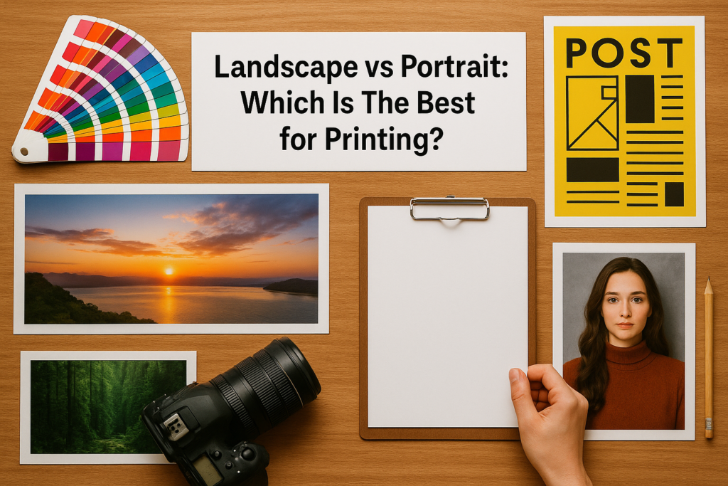
Understanding Orientation in Print Design
Image orientation refers to the way visual elements are framed on a page or surface. A portrait layout is a vertical format, where the height exceeds the width. This format emphasizes vertical flow, making it ideal for documents with linear reading patterns such as letters, books, or flyers. A landscape layout is a horizontal format, where the width is greater than the height. It supports wide compositions and is often used in photo books, brochures, presentations, and panoramic artwork.
In printing, orientation directly influences the paper orientation, page count, image placement, readability, and final product dimensions. Whether your content includes vertical photography or horizontal photography, the layout should match the aspect of your visual and textual material.
To dive deeper into how orientation applies to fine art and painting, check out:
👉 Landscape vs Portrait in Art: Key Differences
Portrait Orientation: When to Use Vertical Format for Printing
Portrait orientation is the most commonly used format for printed documents. It closely resembles the way we naturally read text—from top to bottom—and supports familiar dimensions like A4, US Letter, and book sizes.
This vertical format is ideal for:
- Resumes and reports: Portrait supports a single-column layout, ideal for structured content with a linear flow.
- Magazines and novels: Easy to hold and flip, portrait orientation supports long-form storytelling and reader navigation.
- Flyers and posters: When wall space is limited or a vertical presence is required, portrait works best.
- Portrait photography prints: Emphasizes the subject’s posture, face, or body in a way that fits the format naturally.
- Certificates, forms, and legal documents: Portrait orientation matches typical binder or folder usage.
Portrait layout also allows for cleaner typography hierarchy, especially in vertical graphics. Designers can emphasize visual hierarchy by stacking information from header to subhead to body text. In terms of layout grid, vertical orientation accommodates multiple sections with consistent padding and spacing, which improves scan-ability.
Landscape Orientation: Advantages of Horizontal Format in Printing
While less commonly used for text-heavy documents, landscape mode has distinct advantages in specific types of printed media. This orientation supports a more expansive view and is excellent for visuals that demand width or spatial context.
Common uses of landscape orientation in print include:
- Photo books and portfolios: Landscape orientation aligns well with wide-format photos and horizontal subject framing.
- Brochures and catalogs: A two-page spread in landscape allows for side-by-side product images, feature comparisons, and service breakdowns.
- Calendars: Wall and desk calendars typically use landscape for visual balance.
- Wide-format printing: Banners, signage, and panoramic images are naturally suited for horizontal display.
- Presentation slides and visual reports: Printed versions of slide decks are most readable in landscape format due to screen orientation matching.
Landscape flyers can accommodate infographics, charts, or horizontally-oriented product photos, offering more visual room than portrait flyers. It also supports multi-column layouts more comfortably, making it a preferred choice for complex, image-rich marketing content.
For designers building banners or layouts that span horizontally, see:
👉 Landscape vs Portrait in Graphic Design
Aspect Ratio Considerations
In printing, aspect ratio is essential. Portrait orientation typically follows 8.5×11 (US Letter), A4 (210×297 mm), or similar dimensions. Landscape versions of these sizes simply rotate the orientation to emphasize width. But depending on the format, orientation could significantly affect trimming, folding, and binding.
When designing for custom prints or banners, you may also need to consider ratios like:
- 3:2 or 4:3: Popular in photography and prints
- 16:9 or 9:16: Used in digital design, also for large posters
- Square (1:1): Often used for modern layouts and social-media-to-print crossover materials
Planning your aspect settings early helps reduce production errors and misalignment in the final printed product.
Orientation and Image Quality in Print
Image quality in print is closely tied to the photo layout and the orientation of the visual content. If your image was captured in portrait mode, forcing it into a landscape layout can lead to awkward cropping or excessive whitespace. Similarly, horizontal photography loses impact when squeezed into a narrow vertical frame.
To maintain professional results, always match your print orientation to the primary image orientation. When in doubt:
- Use vertical orientation for people and isolated subjects.
- Use horizontal layout for environments and group scenes.
- Choose the format that minimizes distortion or loss of detail.
A consistent orientation helps preserve image integrity, resolution, and visual storytelling across printed media.
Orientation and Paper Handling
Practical concerns like binding, trimming, and user experience also impact the best choice for orientation. Portrait pages are easier to flip, file, and staple. Landscape pages may require spiral binding or center staples, which can be more expensive to produce.
Additionally, if your document will be photocopied, faxed, or scanned, portrait orientation is typically more compatible with default office equipment. These operational factors can affect cost, production time, and usability.
Orientation and Print vs Digital Flow
In the broader context of print vs digital, orientation determines how easily a piece of content moves between media. Portrait orientation is often used for digital PDFs, eBooks, and online documents, while landscape is favored for digital slideshows and widescreen display.
When designing a document that needs to function both online and in print, consider using a hybrid layout or responsive format that adapts to multiple platforms.
To understand this dual-format strategy, check:
👉 Landscape vs Portrait: What’s the Difference?
Poster Orientation and Marketing Collateral
For marketing teams, poster orientation can change how messages are received in public spaces. Vertical posters stand tall and are ideal for narrow placements like elevator walls or doors. Horizontal posters perform better in wide, open areas where they’re read from a distance.
When choosing orientation for promotional prints like:
- Event signage
- Directional boards
- Indoor banners
…always consider viewer proximity, environmental constraints, and design hierarchy. Portrait and landscape layouts require different approaches to typography, color balance, and visual weight distribution.
Final Considerations for Designers and Printers
Choosing between portrait and landscape orientation is a strategic decision, not just a stylistic one. It’s influenced by:
- The type of content: Is it text-heavy or image-driven?
- The layout structure: How many columns, sections, or visuals?
- The distribution channel: Is it print-only or cross-platform?
- The user interaction: Will it be displayed, filed, folded, or flipped?
In general:
- Use portrait orientation when printing forms, booklets, letters, and single-subject documents.
- Use landscape orientation for presentations, photo spreads, infographics, and collaborative documents.
A well-chosen orientation improves user experience, visual clarity, and overall communication impact—making it a fundamental part of print design success.
Conclusion
So, which is best for printing—landscape vs portrait? The answer depends on your content, audience, and platform. Portrait orientation is versatile, familiar, and ideal for traditional reading. Landscape orientation offers visual flexibility, horizontal flow, and expanded design possibilities.
Rather than asking which is “better,” ask which is more appropriate for your message. The best results come from matching orientation to intent—and ensuring your layout, typography, and visual assets align with your chosen format.
By understanding how orientation shapes storytelling, usability, and production, you’ll be better equipped to create professional, impactful print materials—every time.